5 Reasons Your Coaching Landing Page Isn't Converting Visitors Into Clients
Your coaching landing page might not be converting visitors into clients because it’s missing the mark in these five key areas:
- Unclear Value Proposition: Visitors need to immediately understand how your coaching solves their problems. Focus on outcomes, not your process.
- Message Mismatch: If your ad promises one thing but your landing page shows another, visitors lose trust and leave.
- Too Many Distractions: Navigation menus, multiple CTAs, or unnecessary links confuse visitors. A single, clear focus works best.
- Weak or Missing CTA: Vague or uninspiring calls-to-action fail to guide visitors. Use action-driven language like "Book Your Free Call Today."
- Lack of Trust Signals: Without testimonials, credentials, or proof of results, potential clients hesitate to take the next step.
Key Fixes:
- Simplify your page design and focus on one goal: booking a call.
- Use specific, outcome-focused messaging that resonates with your audience.
- Align your landing page content with your ads to maintain trust.
- Include clear CTAs and repeat them strategically throughout the page.
- Add testimonials, credentials, and case studies to build credibility.

5 Reasons Coaching Landing Pages Fail to Convert and How to Fix Them
How I Transformed This Coaching Page for More Signups!
sbb-itb-f7e72a6
Reason 1: Unclear Value Proposition
When someone visits your coaching page, the first question on their mind is, "Why should I invest?" If you don't answer this within 3 to 5 seconds, they're likely to leave without a second thought [3]. A strong value proposition isn't about showcasing your credentials or explaining your unique methods. Instead, it’s about showing potential clients how their lives will improve by working with you. This clarity is what grabs their attention and keeps them engaged.
A common mistake many coaches make is focusing too much on their process instead of addressing the client's pain points. For example, saying, "I use a transformative 12-week framework that blends positive psychology and somatic practices", doesn’t tell visitors much about the actual impact of your coaching [2]. Instead, your messaging should start with the problem your client is experiencing. For instance, "Everyone thinks you have it all figured out. You know you're falling apart" speaks directly to a potential client’s struggle [2].
"Sarah doesn't give a single damn about your framework right now. She wants to know if you understand what it feels like to wake up every morning in a life that looks perfect on paper but feels hollow." - Karen Lunde, Web Designer and Marketing Strategist, Chanterelle Marketing Studio [2]
What Makes a Strong Value Proposition
A strong value proposition answers three essential questions: What does this do? Who is it for? What outcome does it produce? [3] These questions keep the focus on the client’s needs. Shifting from a feature-driven approach to an outcome-driven one can significantly boost your conversion rate - from as low as 2% to as high as 15% [3].
To refine your messaging, apply the "So What?" Test to every claim you make. For example, if you mention a "12-week program", ask yourself, "So what?" The answer might be, "Save 10 hours of stress per week." That’s the real value - an outcome that directly matters to your audience.
Your headline should be above the fold - meaning it’s immediately visible without scrolling [4]. Use design elements like size, contrast, and whitespace to make it stand out [3]. Avoid vague phrases like "The future of coaching" or "Your partner in growth." Instead, focus on clear, specific outcomes that resonate with your audience.
Examples of Effective vs. Ineffective Messaging
Here’s a quick comparison to help you fine-tune your messaging:
| Feature | Ineffective Value Proposition | Effective Value Proposition |
|---|---|---|
| Focus | The coach's process ("12-week framework") | The client's problem ("Can't sleep at 11 PM") |
| Language | Vague/Jargon ("Holistic approach") | Specific/Relatable ("Navigating an empty nest") |
| Targeting | Everyone ("Entrepreneurs and parents") | Specific niche ("Women in midlife") |
| Goal | Sounding impressive | Being useful and outcome-oriented |
Generic messaging often falls flat, while targeted messaging connects directly with your audience’s needs [2]. For example, when IMD Business School revamped the messaging on their MBA program landing page to focus on outcomes, their conversion rate increased from 3.91% to 6.38% - a 63% jump [1]. The key wasn’t adding more content but making the message sharper and clearer.
Finally, review your "You/Them" ratio to ensure your messaging is client-focused. Aim for at least three times as many sentences addressing the client’s challenges as those highlighting your qualifications [2]. If your page feels like a resume, you risk losing visitors before they even understand how you can help them.
Reason 2: Message Mismatch Between Ads and Landing Page
Imagine clicking on a Facebook ad that promises a "Free 30-Minute Breakthrough Session", only to land on a page promoting "Comprehensive Coaching Packages." Frustrating, right? This disconnect, known as message mismatch, is a surefire way to lose potential clients. Visitors don’t leave because they can’t find what they need - they leave because bridging the gap between the ad and the landing page feels like too much work [5].
"The bounce decision happens not because the visitor cannot find what they need but because the effort required to find it exceeds their willingness to invest." - Atticus Li, Leads applied experimentation at NRG Energy [5]
This disconnect creates cognitive friction - a fancy way of saying it makes people work harder than they should. When your landing page mirrors the language and visuals of your ad, visitors process the information smoothly. But when there’s a mismatch, they shift from evaluating your offer to questioning whether they clicked the wrong link. That moment of doubt is often the last moment they spend on your page. Consistency in messaging builds trust, which is essential for keeping visitors engaged.
It’s not just about losing traffic - message mismatch can erode trust entirely. Experts call this zero or negative trust velocity, where trust not only stops growing but actually declines [5]. Visitors may feel tricked, wondering if they’ve fallen for a bait-and-switch. For example, in 2026, cybersecurity company Flare.io tackled this issue by aligning their landing page headline with their ad’s promise and moving their main call-to-action (CTA) above the fold. The result? A 65% jump in demo conversions within a week [1].
Aligning Landing Page Content with Traffic Sources
To avoid message mismatch, make sure your landing page aligns with your ad in four key areas: verbal, visual, offer, and audience [5].
- Verbal match: Use the same words and phrases from your ad in your landing page headline. For example, if your ad says "Overcome Imposter Syndrome in 90 Days", your landing page should repeat that exact promise - not switch to something like "Unlock Your Full Potential."
- Visual match: Keep the same color scheme, imagery, and overall design. If your ad features warm tones and a casual photo, don’t greet visitors with a stark, corporate-looking page.
- Offer match: Make sure the highlighted offer on your ad is front and center on your landing page. If you’re promoting a free session, don’t bury it under paragraphs about your process or methodology.
- Audience match: Tailor the language to the specific group you’re targeting. An ad aimed at "Executive Coaches Scaling to Six Figures" should land on a page that speaks directly to that niche, not a generic message for all coaches.
A practical way to ensure perfect alignment is by using Dynamic Text Replacement (DTR). This tool swaps out landing page text based on URL parameters, matching the ad copy or search query that brought the visitor there [5]. Radicle Science implemented this strategy in 2026 for a clinical trial enrollment campaign. By pairing social media ads with a streamlined landing page featuring a single, clear CTA, they achieved a conversion rate of 51.78% - that’s 3,443 conversions from 6,649 visitors [1].
The right landing page can make a big difference. Sending traffic to a generic homepage instead of a tailored landing page often results in much lower conversion rates. In fact, creating a dedicated landing page that matches the ad can boost conversions by 50% or more [5]. And don’t forget: removing distractions like navigation menus and footer links can increase conversions by another 20-30% [1]. The goal is simple - deliver exactly what the ad promised, in the exact way it was promised, as soon as visitors arrive. Up next, we’ll dive into how reducing on-page distractions can take your conversion rates even higher.
Reason 3: Too Many Distractions on the Landing Page
After refining your messaging, the next step is to ensure your landing page design eliminates distractions that could derail your offer.
Your landing page should present one clear choice. When visitors are faced with multiple competing options - like "Download my guide", "Join my newsletter", "Follow me on Instagram", or "Take my quiz" - it can overwhelm them. The result? They do nothing and leave. This phenomenon aligns with Hick's Law: the more choices you introduce, the longer it takes for someone to decide, increasing the likelihood they'll abandon the page altogether [1][2].
Think of your landing page like a one-on-one conversation with a potential client. If you're simultaneously directing them to your blog, social media, or about page, you're not having a focused discussion - you're bombarding them. Elements like navigation menus, footer links, or social media icons act as escape routes, pulling attention away from your primary offer [1].
The data backs this up. Removing navigation links alone can boost conversion rates by 20–30% [1]. Simplifying your page to focus on a single call-to-action (CTA) can increase conversions by 30% or more [1]. For example, pages with just one CTA achieve an average conversion rate of 13.5%, compared to 10.5% for pages with multiple CTAs - a 22% difference [3]. Flare.io saw a 65% jump in demo conversions within a week after simplifying their landing page by strengthening the headline and moving the main CTA above the fold [1].
"Simplifying your page to a single CTA can lift conversion rates by 30% or more - every extra link is a potential exit." - Waseem Bashir, CEO, Apexure [1]
The Importance of a Single Focus
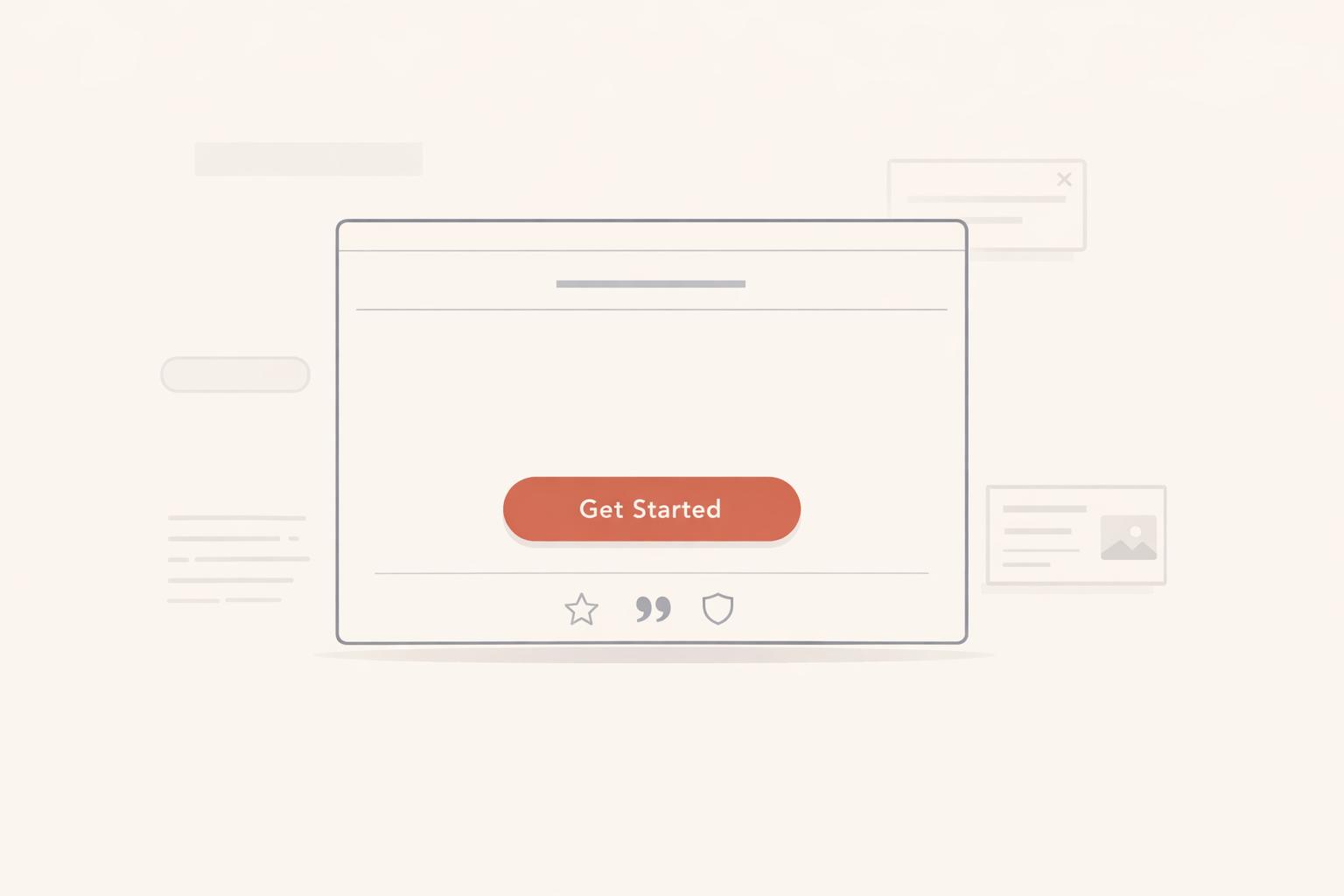
A landing page has one job: to turn visitors into clients. It's not the place to show off your coaching philosophy, list every service, or link to your Instagram. Trying to do too much dilutes your message and reduces effectiveness. Instead, stick to one goal, one page, and one clear action. Repeat the main CTA at key points - top, middle, and bottom - so it’s always accessible without overwhelming visitors [1].
Radicle Science nailed this concept with a clinical trial enrollment page that achieved a 51.78% conversion rate. They converted 3,443 participants out of 6,649 visitors by sticking to a single CTA and reinforcing one clear value proposition throughout [1].
When someone clicks on an ad promising "Overcome Imposter Syndrome in 90 Days", they’re in a focused mindset, looking for a solution. Adding extra navigation links, popups, or chatbots creates unnecessary mental clutter. They came to learn about your coaching offer - not to explore your entire website [1].
Once you’ve narrowed the focus, the next step is to fine-tune every element of the page for clarity and simplicity.
Streamlining Design for Coaches
Start by auditing your landing page with a critical eye. Remove any clickable elements that don’t directly lead to your primary goal: booking a call. Every detail should guide visitors toward this objective, reinforcing the purpose of your page.
For campaign-specific pages, eliminate navigation bars and footer links entirely. These features act as distractions, pulling visitors away from your offer [1]. If you need to include a secondary option - like a newsletter signup for those not ready to book - make sure it’s visually less prominent. Use smaller text, muted colors, and place it lower on the page.
Leverage white space effectively. Empty space isn’t wasted - it directs attention to what matters most. A cluttered page filled with dense text, multiple images, and competing elements creates visual chaos, making it harder for visitors to focus on your offer [1].
"Nobody wants to feel stupid. Nobody wants to book a call just to find out what you're selling or discover they can't afford it." - Karen Lunde, Web Designer, Chanterelle Marketing Studio [2]
Simplify your forms. Only ask for the essentials - typically just a name and email address. Additional details can be gathered later during onboarding. Reducing form fields from 11 to 4 has been shown to boost conversions by up to 120% [3]. Each unnecessary field adds friction and increases the chance of abandonment.
The goal is to create a calm, focused experience that gently nudges visitors toward one clear decision. Use bold subheadings and concise bullet points to replace dense paragraphs. Swap out generic stock images for authentic photos that reflect your coaching environment [3]. Every element should answer one question: "Does this help visitors decide to book a call?" If the answer is no, it doesn’t belong on the page.
Reason 4: Weak or Missing Call-to-Action (CTA)
You've streamlined your landing page and eliminated distractions, but now comes the critical part: guiding your visitors to take the next step. If your page doesn’t clearly spell out what action they should take, you risk losing them entirely. A weak or missing CTA is like pitching to a potential client and walking away without asking for the sale.
Every element on your page - messaging, layout, and CTAs - should work together to direct visitors toward booking a call or taking the next logical step.
One common misstep is relying on vague, uninspiring language. Buttons with labels like "Submit", "Learn More", or "Click Here" merely describe an action without highlighting any benefit. To drive results, your CTAs need to be specific and action-oriented. For example, replace "Download" with "Get My Free Report" or swap "Contact Us" for "Book My Free Consultation." This shift in approach can boost conversions by 30–40% [6][7].
"Your call-to-action button is the single most decisive element on any landing page. It is the point where attention, trust, and intent converge into a click – or don't." - Waseem Bashir, CEO, Apexure [7]
Another critical error is the "ghost town" effect - a page that leaves visitors unsure of what to do next. They might resonate with your message but leave without engaging because there’s no clear path forward. To prevent this, your CTA should be visible and repeated strategically throughout the page: at the top, after explaining your solution, following social proof, and at the bottom. This repetition can increase conversions by 20–35% [7].
| Weak CTA (Passive) | Strong CTA (Action-Oriented) | Why It Works |
|---|---|---|
| Submit | Get My Free Strategy Session | First-person + Specificity |
| Learn More | See How It Works | Low commitment + Curiosity |
| Contact Us | Book My Free Consultation | Action-oriented + Value |
| Sign Up | Start My 14-Day Trial | Time-bound + Ownership |
Crafting Action-Oriented CTAs
The best CTAs use commanding verbs that give visitors a sense of control and ownership. Swap out generic labels for benefit-driven language that emphasizes what your audience will gain. Words like "Claim", "Get", or "Book" focus on the reward rather than the action itself [6].
Using first-person language can also make a big impact. For instance, "Get My Free Audit" often outperforms "Get Your Free Audit" by fostering psychological ownership. This subtle tweak can increase click-through rates by 10–25% [7].
In March 2026, Flare.io, a cybersecurity company, saw a 65% jump in demo conversions within a week by changing their CTA from "Request a Demo" to "See Flare in Action." Apexure, the agency behind the project, also moved the CTA above the fold and simplified the page layout [7]. The lesson? Specific, energetic language paired with strategic placement can make all the difference.
Adding micro-copy beneath your CTA can address lingering doubts. Phrases like "Takes less than 60 seconds", "No credit card required", or "Cancel anytime" reduce friction and encourage action [7]. For coaching pages, consider reassuring notes like "Free consultation - no obligation" or "We'll respond within 24 hours" to make the decision feel safe and low-risk.
Creating Urgency in Your CTAs
Urgency can be a powerful motivator when done right. However, avoid gimmicks like fake countdown timers that reset with every visit - they erode trust [1]. Instead, tie urgency to real factors, such as limited availability, time-sensitive bonuses, or seasonal pricing. For example, phrases like "Only 3 spots left this month" or "Pre-summer pricing ends Friday" give visitors a logical reason to act now [1].
Time-sensitive language like "Today", "Now", or "Before Midnight" adds energy and encourages immediate action [6]. Compare "Book a Call" with "Book Your Free Call Today" - the latter implies that waiting could mean missing out. You can also frame inaction as a loss, such as "Start your transformation today - before another month slips by" [6].
"No penalty for waiting equals no reason to act." - Magnetic Marketing [6]
Social proof can amplify urgency. Highlighting how others are engaging with your offer - e.g., "47 people booked this week" - creates a sense of FOMO (fear of missing out) and validates the decision to act [1]. For instance, in 2026, Radicle Science achieved a 51.78% conversion rate (3,443 conversions from 6,649 visitors) by using a single, repeated CTA - "Join the Study" - paired with reassuring micro-copy like "100% free participation" [7].
To make urgency feel authentic, offer real-time incentives like expiring bonuses or clear deadlines for pricing changes. Trust is essential, so ensure your urgency tactics align with genuine business constraints.
With clear, compelling, and urgent CTAs, your landing page will guide visitors toward immediate action while building trust and momentum.
Reason 5: Lack of Trust Signals
Your landing page might have everything - clear messaging, a strong value proposition, minimal distractions, and compelling CTAs - but if visitors don’t trust you, none of it matters. Trust is the invisible bridge between interest and action. Without it, even the most polished landing page won’t convert. People need proof that you can deliver results, or they’ll hesitate and leave without taking the next step.
Here’s a striking fact: visitors form a judgment about your credibility within 50 milliseconds of landing on your page [12]. That’s barely enough time for them to read a headline, let alone assess your qualifications. If your page lacks visible trust signals - like testimonials, credentials, or social proof - you’re essentially asking strangers to take a leap of faith. For coaching businesses, showing a real person with a name, photo, and credentials is critical [8][10].
"People hire people, not logos. If your landing page has a logo, a tagline, and a contact form but no face and no name, you're asking buyers to trust an abstraction." - Stan Tscherenkow, Founder, Stan Consulting LLC [8]
The absence of trust signals can seriously hurt conversions. For instance, adding reviews to a landing page can boost conversion rates by up to 270% [9]. Even including just three short testimonials has been shown to increase purchases by 34% [9]. A great example comes from IMD Business School, which revamped its MBA program landing page in 2026. By moving video testimonials and "About Us" content higher on the page, they saw their conversion rate jump from 3.91% to 6.38% - a 63% increase [1].
Building Credibility with Social Proof
Social proof shifts your message from "trust me" to "look at what others have experienced" [9]. Generic praise doesn’t cut it. Effective testimonials include a client’s photo, name, title, and a clear result. For example, instead of a vague statement, try something like: "Working with Sarah, I increased my monthly revenue from $8,000 to $23,000 in just four months." - John Martinez, Marketing Consultant, Austin, TX.
Video testimonials are even more powerful. They’re hard to fake and allow potential clients to sense authenticity, boosting conversions by up to 80% [9][11]. If video isn’t an option, use real professional headshots - never stock photos or anonymous initials. These can instantly undermine credibility [11].
Placement matters too. Position your strongest testimonial within 200 pixels of your main CTA button [11]. For instance, a hotel institute in Switzerland increased lead form submissions by 50% simply by placing a standout testimonial directly above their signup form [11]. Social proof placed above the fold can increase conversions by as much as 65% [1].
For deeper credibility, case studies and client success stories are invaluable. Highlight "Before vs. After" transformations to help potential clients envision their own results [11]. If you’ve worked with well-known brands, displaying their logos can also enhance trust [9].
Showcasing Expertise and Credentials
Credentials act as a bridge between your actual expertise and what visitors perceive within those critical first moments [10]. For many high-level clients, verified credentials are a must [12]. Make your top credential visible above the fold [12]. Whether you’re an ICF-certified coach, a licensed therapist, or hold an MBA, showcase it prominently. Third-party validations - like industry awards, media mentions, or professional certifications - add authority. Trust badges or security seals next to form fields or CTAs also reduce hesitation at the point of decision [9][12].
If you’ve been featured in major publications, taught at universities, or spoken at industry events, highlight those achievements where visitors are likely to make decisions [10].
Avoid overwhelming the page with too many badges. Stick to three to five impactful ones and save the footer for a comprehensive list of affiliations or minor certifications [12].
"Proof is the evidence that you've earned your expertise and that you can deliver what you promise. Testimonials, media features, credentials... The things that turn 'sounds good' into 'I trust this.'" - Megan Desjarlais, Founder, Purpose & Pixel [10]
Be specific. Numbers are more convincing than vague claims. For example, "Helped 11,247 students" is far more believable than "Helped thousands" [9]. If you offer a money-back guarantee or refund policy, highlight it near your CTA to address any lingering doubts. Even a simple assurance like "100% satisfaction guaranteed" can make a difference [8].
Above all, authenticity is non-negotiable. A single fake testimonial or outdated certification can destroy trust permanently [12]. Make sure every testimonial, badge, and credential is up-to-date and verifiable. Sophisticated buyers often do their homework, so it’s essential to back up your claims with real, credible evidence.
Conclusion
Let's break down what can turn your landing page from a missed chance into a client-converting machine.
Landing pages fail to convert when they fall into five common traps: an unclear value proposition, mismatched messaging with ads, overly busy designs, weak or missing calls-to-action (CTAs), and a lack of trust signals. The good news? Each of these problems has a clear fix.
Start by addressing your audience's specific pain points - their "3 AM panic" moments - rather than focusing on your own framework or process. Simplify the user's path by removing navigation menus and secondary links; this alone can increase conversion rates by 20% to 30% [1]. Avoid generic CTAs and instead, use action-driven language that motivates visitors to act immediately.
"Landing page optimization is not a one-time project - it is an ongoing discipline." - Waseem Bashir, CEO, Apexure [1]
The difference between a 2% and a 10% conversion rate isn't random - it comes down to strategic design choices. Regularly audit your page, implement focused changes, and test them rigorously. Even small adjustments, like reducing form fields from 11 to 4, can result in a 120% increase in conversions [3]. These small but meaningful tweaks can drive big results.
Keep refining your landing page to turn every visitor into a client.
FAQs
What’s the fastest way to fix my value proposition?
The fastest way to strengthen your value proposition is to ensure it's clear, specific, and audience-focused. Speak directly to your audience's challenges and emphasize the unique benefit or transformation you provide. Skip overused, generic phrases and concentrate on how your offering solves problems or delivers results. A sharper headline and a more focused core message can quickly enhance clarity and drive better conversions.
How can I keep my ads and landing page perfectly aligned?
To make sure your ads and landing page work together seamlessly, focus on keeping messaging, visuals, and CTAs consistent. Your ad copy should match the headline on your landing page, creating an immediate connection for visitors. Use the same visuals and branding across both to maintain a cohesive look. Also, align your CTAs so they guide visitors toward the same goal. Stick to clear messaging centered on a single offer - this avoids confusion and helps boost conversions. Consistency not only improves the user experience but also builds trust with your audience.
Which trust signals should I add first to boost conversions?
To increase conversions, make sure to place social proof elements prominently above the fold. This could include customer reviews, testimonials, or well-known brand logos. These features are powerful tools for quickly establishing trust with visitors. Research indicates that showcasing these elements in a visible spot can lead to noticeable improvements in trust and conversion rates. Keep them clear and attention-grabbing for the best results.
Related Blog Posts

Blog title heading will go here
Blog title heading will go here