
7 Things to Fix on Your Coaching Website Before You Run Any Ads
Running ads without fixing your website is like pouring water into a leaky bucket. Nearly 90% of failed ad campaigns are due to poor landing page experiences, not the ads themselves. Before spending a single dollar on ads, ensure your coaching website is ready to convert visitors into leads.
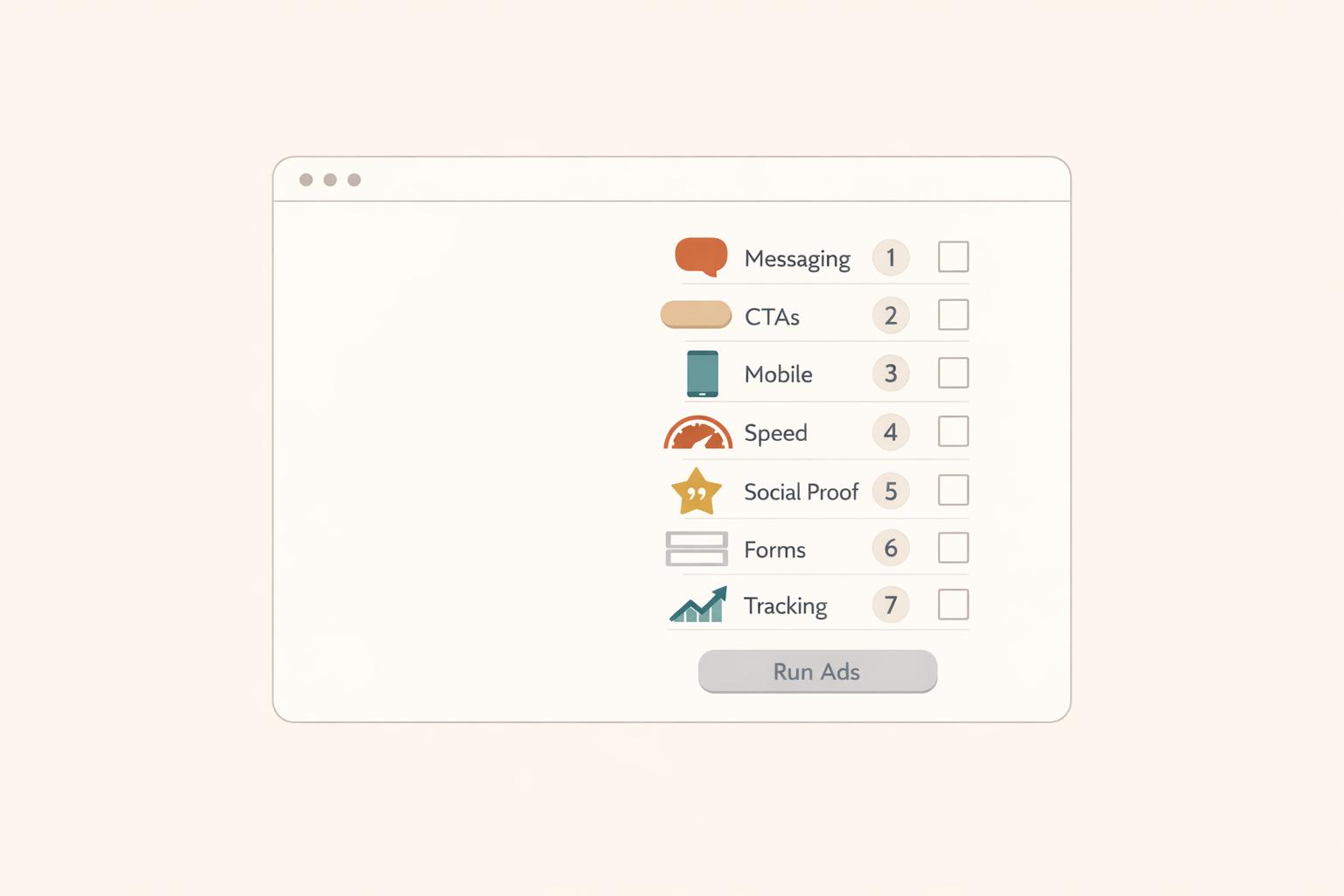
Here are the 7 key fixes to focus on:
- Clear Value Proposition: Ensure your homepage instantly communicates who you help, the problem you solve, and the transformation you provide.
- Strong Calls-to-Action (CTAs): Use focused, action-oriented CTAs like "Book a Free Call" and avoid generic ones like "Submit."
- Mobile Responsiveness: Make sure your site is easy to navigate on phones, with properly sized buttons and fast load times.
- Social Proof: Add testimonials or success stories to build trust and reduce hesitation.
- Page Load Speed: Optimize images, scripts, and hosting to ensure your site loads in under 3 seconds.
- Lead Capture Forms: Use simple, visible forms to collect visitor information and generate leads.
- Analytics & Tracking: Set up tools like Google Analytics and Facebook Pixel to monitor performance and optimize campaigns.
Fix these issues first to avoid wasting ad dollars and turn your website into a lead-generating machine.

7 Website Fixes to Make Before Running Coaching Ads
8 Must Haves For A Highly Converting Coaching Website | Visibility Marketing Coach
sbb-itb-f7e72a6
1. Missing Clear Value Proposition on Homepage
Your homepage has about 10 seconds to answer one critical question: "Is this for me?" [6]. If visitors can’t quickly figure out what you offer and who you serve, they’ll likely move on.
A value proposition isn’t just a catchy tagline. It’s a clear, concise statement that explains how you solve a specific problem for a specific audience. Karen Lunde from Chanterelle Marketing Studio puts it perfectly:
"Clients choose the coach who genuinely understands their struggles - the coach who inspires the thought, 'She truly understands my struggle. She's been where I am.'" [2].
Impact on Conversion Rates
Here’s the reality: a well-crafted value proposition can increase your sales conversion rate by over 10% [3]. The issue many coaches face is focusing too much on their process instead of addressing the immediate concerns of their clients. For instance, saying, "12 transformative sessions using my proprietary framework" might sound impressive, but it won’t resonate with someone lying awake at night worrying about their crumbling marriage. A statement like, "Help for women navigating divorce without losing themselves in the process", directly addresses their fears and draws them in.
Ad Campaign Readiness
Before you even think about running Facebook or Google Ads, make sure your value proposition is rock-solid. Laura M. Browning from HubSpot emphasizes:
"Your value proposition is the foundation of your marketing strategy and a critical conversion factor" [5].
Without it, you’re essentially paying to send traffic to a site that doesn’t connect with visitors or give them a reason to stay. A strong value proposition not only grabs attention but also supports all the technical improvements you’ll make later.
Want to test your messaging? Use the 5-second test: show your homepage to someone unfamiliar with your business. If they can’t describe what you do and who it’s for within five seconds, it’s time to refine your message [5]. Try using the Steve Blank framework to clarify your offering: "We help [X] to [Y] by [Z]" [3]. For example: "We help burned-out executives regain work-life balance through personalized coaching and accountability."
Ease of Implementation
The good news? Fixing your messaging doesn’t take long. Spend a weekend answering these three questions in a Google Doc:
- What problem is keeping your client up at night?
- What transformation are they hoping for?
- Why are you the right person to help them?
For every sentence about your background, write at least three sentences focused on your client’s struggles [2].
Avoid generic phrases like "world-class" or "industry-leading" - these often confuse more than they clarify [2][4]. Instead, call out your client’s specific pain point in your headline, and follow it up with a sub-headline explaining who you serve and the change they can expect. Adding a hero image with directional cues, like a person looking toward your text, can also improve engagement [4].
Once your homepage has a clear value proposition in place, you’ll have a strong foundation to build on as you tackle the technical elements in the next steps.
2. Weak or Missing Calls-to-Action
Once your value proposition is clear, the next step is guiding visitors to take action with strong calls-to-action (CTAs). Here's a critical stat: 90% of website visitors only read headlines and CTA text [8]. If your CTAs are unclear, bland, or missing altogether, you're essentially throwing away ad dollars as potential leads slip away.
Impact on Conversion Rates
A single, focused CTA on a page can boost clicks by up to 371% and sales by up to 1,617% [9]. However, many coaching websites fall into what Karen Lunde calls the "buffet of options" trap - offering too many choices like newsletter signups, social media links, and discovery calls all at once. This overload often leads to decision paralysis, leaving visitors unsure of what to do, so they do nothing [2].
Want more proof? Button-based CTAs perform 30% better than regular text links [8]. Personalized CTAs? They outperform generic ones by 202% [8][9]. Even small tweaks like adding more white space around a CTA can improve conversion rates by 232% [9]. For service businesses, phone calls convert 5x better than contact forms [10], yet many websites hide phone numbers in the footer instead of making them prominent. These small but impactful changes can turn passive visitors into active leads.
Ad Campaign Readiness
Strong CTAs are critical for ad campaigns to succeed. Without them, even the most well-crafted Facebook or Google Ads will fail to convert. Visitors might enjoy your content, but if they don’t know the next step, they’ll leave. Andi Coombs from KlientBoost sums it up perfectly:
"SUBMIT is the hellspawn of terrible CTAs across the universe" [8].
Instead of using generic buttons like "Submit" or "Contact Us", opt for more engaging, result-oriented phrases like "Book Your Free 15-Minute Strategy Session" or "Get My Personalized Plan." Tailor your CTA to the audience's familiarity with your brand. Cold traffic from ads might respond better to low-commitment CTAs like "Learn More" or "See How It Works", while warmer leads can handle direct asks like "Book Now" [8]. Adding a bit of reassurance - such as "No credit card required" or "Cancel anytime" - near the CTA button can increase conversions by 124% [9].
Ease of Implementation
The good news? Fixing CTAs is quick and impactful. Most updates take 2-3 hours and can significantly boost lead generation [10]. Start by reviewing each webpage and ensuring there’s one primary CTA - often "Book a Free Consultation" for coaches. Place it in key spots: above the fold, within the content, and at the bottom of longer pages [11]. For mobile users, make phone numbers clickable using HTML (<a href="tel:...">) and consider adding a sticky "Call Now" button that stays visible as they scroll [10]. One business saw a 180% increase in calls in just a week by moving their phone number from the footer to the header [10].
Use action-driven verbs like "Start", "Get", "Join", or "Discover" [7][9]. Add a short "click trigger" below the button, such as "Feel great in a week!" to nudge visitors toward action [8]. Clarity is key - let people know what happens next. As Karen Lunde points out:
"Nobody wants to feel stupid. Nobody wants to book a call just to find out what you're selling or discover they can't afford it" [2].
Include essential details near your CTA, like what the call involves or starting price ranges. This helps visitors self-qualify and ensures you attract serious leads.
3. Poor Mobile Responsiveness
Once you've fine-tuned your calls-to-action, it's time to focus on how your website performs on mobile devices. A site that's optimized for mobile is essential for capturing leads effectively. If your coaching website feels clunky or broken on a phone, visitors might leave before even considering your offer. Remember, mobile users are often navigating with one hand while multitasking. Tiny buttons, overlapping text, or confusing layouts can frustrate them quickly. And if you're running paid ads, every bounce means wasted ad dollars.
Impact on Conversion Rates
A poorly designed mobile experience can take a serious toll on your conversion rates. For instance, buttons that are too small or too close together can lead to accidental taps - like someone trying to hit "Submit" but accidentally pressing "Back." To avoid this, make sure your buttons meet recommended sizes: 48×48 px for Android and 44×44 px for iOS, with at least 8 px of spacing between them. These small adjustments not only improve user experience but also help maintain a good reputation with ad platforms and search engines, which can lower your cost per acquisition [12].
Ad Campaign Readiness
Platforms like Google and Facebook scrutinize your mobile landing pages. If your site has slow load times, unstable layouts, or confusing navigation, your ads might not perform well - and you could end up paying more for clicks. Issues like overlapping text and layout glitches can also make your coaching business seem unprofessional. Before you launch any ad campaigns, test your mobile site. Can users easily book a call, view pricing, or contact you with just their thumb? If not, it's time to fix those issues to ensure your site is ad-ready.
Ease of Implementation
Improving mobile responsiveness doesn't have to be complicated. Start by adding the viewport meta tag (width=device-width, initial-scale=1) to ensure your design scales correctly [12]. Replace fixed-width containers (like width: 1200px) with fluid grids using percentages or rem units, so your content adjusts naturally to different screen sizes. Use the right input types (e.g., type="tel" for phone numbers) to bring up appropriate keyboards on mobile devices. For better readability, set text sizes to 16–18 px with a line-height of 1.4–1.6. Finally, speed up load times by using modern image formats like WebP and enabling lazy loading for images [12]. These tweaks can make a big difference in your site's mobile performance.
4. No Social Proof or Testimonials
Once your website's functionality is polished, the next step is building trust. And trust hinges on social proof.
Even if your coaching site boasts sleek design and persuasive copy, lacking testimonials means you're essentially asking visitors to trust you blindly - and most won't. In fact, 92% of visitors hesitate to buy when there’s no evidence of real client success [14]. Without testimonials, your ad spend can quickly become a stream of wasted clicks.
Impact on Conversion Rates
Social proof is a game-changer for conversions. Landing pages featuring testimonials see a 34% higher conversion rate on average [15]. Meanwhile, products with customer reviews are 270% more likely to sell compared to those without [13]. For coaching services - where you're selling outcomes rather than a physical product - testimonials bridge the gap between skepticism and belief.
Specific success stories are especially powerful. Phrases like “increased revenue by 30% in six months” or “secured three promotions within a year” allow prospects to imagine achieving similar results. And if you're able to showcase video testimonials, even better. These can boost conversion rates by 80% over text-only reviews [14], thanks to their emotional resonance and visual authenticity. The trust they generate not only lifts conversions but also ensures your ad dollars work harder.
Ad Campaign Readiness
Launching ads without social proof significantly raises the risk factor in visitors’ minds. People form opinions about your site in just 50 milliseconds [17] and look for trust signals within the first 5 seconds [15]. If visitors don’t see proof that others have benefited from your coaching, they may view your service as too risky. As Matteo Tittarelli aptly puts it:
"The absence of social proof creates significant friction, with 92% of buyers hesitating when reviews are missing entirely" [14].
Beyond visitor hesitation, ad platforms penalize poor engagement. Low interaction rates can lead to higher costs per click, making it even harder to justify ad spend.
Ease of Implementation
The good news? You don’t need dozens of testimonials to make a difference. Start with 3–5 well-crafted testimonials that highlight specific, measurable outcomes. Use a simple permission form to gather client feedback, asking pointed questions like, “What were you most worried about before seeking help?” These kinds of prompts often yield compelling responses [16].
Strategically place your testimonials: at least one strong example should sit above the fold on your homepage. Add others to high-stakes pages, like your pricing section, to ease purchase anxiety. Include real names, job titles, and photos whenever possible - testimonials with headshots are far more credible than plain text [15]. If you're just getting started, even beta tester quotes or social media shoutouts can help establish initial trust.
5. Slow Page Load Speeds
Your website's speed isn't just a matter of convenience - it plays a critical role in keeping visitors engaged. Research shows that 53% of mobile users leave a site if it takes more than 3 seconds to load[19][20]. When you're paying for every ad click, a slow site can quickly drain your budget by driving away potential clients.
Impact on Conversion Rates
Here's a staggering fact: a one-second delay in page load time can reduce conversions by 7%[19][21]. Websites that load in under 2 seconds maintain an average bounce rate of just 9%, but stretch that load time to 5 seconds, and the bounce rate skyrockets to 38%[20]. As James Gleeson, Founder of Everblue Digital, puts it:
"Speed is not a nice-to-have. It is a revenue lever"[18].
For coaching websites, where trust and professionalism are vital, slow load speeds can send the wrong message. Visitors may perceive a sluggish site as unreliable, leading them to leave before engaging further. This directly impacts your conversions and the effectiveness of your advertising.
Ad Campaign Readiness
A slow website doesn’t just frustrate users - it sabotages your ad campaigns. Visitors may abandon the page before your tracking pixel has time to fire or before they even see your offer. For Google Ads, this means wasted ad spend and reduced campaign efficiency. Additionally, Google considers Core Web Vitals - metrics like Largest Contentful Paint (LCP), Interaction to Next Paint (INP), and Cumulative Layout Shift (CLS) - as key ranking factors[18][21]. A slow site not only hurts your paid traffic performance but also impacts your organic search rankings.
Ease of Implementation
Improving page load speed doesn’t always require advanced technical skills. Start by addressing the most common issues:
- Convert images to modern formats like WebP or AVIF.
- Enable lazy loading to delay loading offscreen images.
- Upgrade your hosting if your Time to First Byte (TTFB) exceeds 600 ms[19][20].
- Audit third-party scripts such as chat widgets, tracking pixels, and CRM integrations, as these can heavily impact load times[19].
Tools like Chrome DevTools can help you identify and defer non-essential scripts[20]. Many of these fixes are straightforward and can be implemented with a bit of focus and attention to detail, even without hiring a developer.
6. Missing Lead Capture Forms
If your site lacks lead capture forms, you're essentially letting your ad traffic vanish into thin air. Just like having a clear value proposition and strong CTAs, lead capture forms are critical for turning paid traffic into potential customers. Without them, visitors might click through, browse your site, and then disappear into the digital void[2]. That means you’ve spent money on a click but gained nothing - no email, no booked call, no follow-up opportunity. Let’s dive into how lead capture forms can make a big difference in your conversion rates.
Impact on Conversion Rates
The data speaks volumes: 84% of marketers rely on form submissions as their main method for generating leads[28]. Why? Because they work. The average conversion rate for lead generation landing pages is 18%[24], but this can vary depending on the offer. For example:
- Cheat sheets: 34% conversion rate
- Checklists: 27% conversion rate
- Ebooks: 24% conversion rate[24]
Even a basic contact form, when designed well, can capture 1-4% of your traffic[22][24]. And here’s a pro tip: reducing the number of form fields from five to three can increase conversions by 20-40%[22]. Every extra field you add lowers your chances of getting that lead.
As Karen Lunde from Chanterelle Marketing Studio explains:
"Nobody wants to book a call just to find out what you're selling or discover they can't afford it"[2].
Your form should focus on solving the visitor’s problem, not creating more friction.
Ad Campaign Readiness
Lead capture forms are the bridge between ad traffic and actionable leads. Without them, your ad spend is like renting attention with no way to turn it into a lasting connection. They’re the final step before conversion, and their design and functionality can make or break your campaign[28].
The type of form you use matters, too. For instance, LinkedIn’s native Lead Gen Forms convert at an average of 13%, while traditional landing pages hover around 4%[25]. That’s a 3x difference in performance, which directly affects your cost per lead. To put it in perspective, LinkedIn Lead Gen Forms typically cost $50-$150 per lead, compared to $150-$500 for traditional landing pages[25].
Speed is another essential factor. 67% of users prefer filling out a form over making a phone call[30], and 4 out of 5 consumers expect a response within 10 minutes of submitting their information[28]. Make sure your forms integrate seamlessly with your CRM to trigger instant follow-ups.
Ease of Implementation
Setting up effective lead capture forms doesn’t require a developer. Keep it simple: limit your form to three to five fields - often just a name and email are enough for a lead magnet[26][29][30]. Place the form in high-visibility areas, like above the fold or in the top right corner, so visitors can’t miss it[29].
Use clear, action-focused button text like "Book your free call", "Get Your Free Guide," or "Schedule now"[23][2]. Ensure your form is mobile-friendly, with buttons sized at least 44×44 pixels and fonts at least 16 pixels to avoid iOS auto-zooming issues[26][30]. Adding a short privacy note such as "No spam. Unsubscribe anytime" near the submit button can also ease any hesitation[26][27].
7. No Analytics or Tracking Setup
Running ads without tracking is like driving without a GPS - you’re moving, but you have no idea if you’re heading in the right direction. Without tracking, you can't tell which pages are converting visitors into clients, which ads are driving results, or where your budget is making an impact. Here's a staggering fact: nearly 90% of failed ad campaigns are due to poor landing page experiences, not the ads themselves[1]. Without proper tracking, you're left guessing, which can lead to wasted ad spend. Setting up reliable tracking tools ensures every dollar spent is accounted for and optimized.
Ad Campaign Readiness
Tracking takes the guesswork out of marketing and proves your return on investment (ROI). Tools like Google Analytics and Facebook Pixel allow you to monitor visitor behavior and retarget potential customers with precision[31]. Focus on meaningful conversions - such as form submissions, booked appointments, or phone calls - rather than vanity metrics like page views[32].
As ClicksGeek explains:
"If you're not tracking marketing conversions properly, you're essentially flying blind - making decisions based on guesses instead of data."[32]
User Experience Insights
Analytics don’t just track conversions; they also uncover user experience issues. For example, Microsoft Clarity, a free tool, provides heatmaps and session recordings that highlight pain points like "rage clicks" or "dead clicks" - indicating broken elements or frustrating user experiences[31]. Addressing these problems before running ads ensures your paid traffic won’t encounter the same obstacles. For businesses that rely on phone calls, dynamic number insertion is a must - it lets you track which campaigns generate calls[32].
Getting Started with Tracking
Setting up tracking doesn’t have to be complicated. Start with the basics:
- Google Analytics: Free and essential for understanding traffic behavior.
- Microsoft Clarity: Another free tool for visualizing user behavior through heatmaps and session recordings[31].
- Google Tag Manager (GTM): Simplifies managing all your tracking scripts in one place, so you don’t have to repeatedly edit your website’s code[32].
Before you launch your ads, check that everything is working. Use tools like Google Tag Assistant or Facebook Pixel Helper to verify your tracking codes[32]. Keep in mind, a 10–20% difference in conversion data between platforms is normal due to varying attribution models[32]. Don’t stress over minor discrepancies - focus on the bigger picture of what’s working and what’s not.
Conclusion
Your website is the backbone of every advertising dollar you spend. If your site isn’t optimized, you’re essentially throwing that money away. Sure, the traffic might come, but without a site that’s ready to convert, those visitors will leave without taking action. In nearly 90% of failed ad campaigns, the real issue wasn’t the ad - it was a poor landing page experience[1].
The good news? Fixing these problems doesn’t mean you need a complete site redesign or a massive budget. With some focused effort, many of these tweaks can be done in just a weekend. And the results speak for themselves: optimized pages can double your conversion rates and cut your cost per lead by 30% or more[1]. When your messaging directly addresses your audience’s biggest worries, your calls-to-action (CTAs) point to a clear next step, and your tracking tools reveal what’s working, every dollar you spend on ads becomes more effective.
Take it from Melanie Gorman, SEO Consultant and Owner at Crownsville Media, who says: "A well-optimized website doesn't just support your ad campaigns, it makes them profitable."[1]
Before you launch your next campaign, make sure your site is ready. Check its mobile performance, refine your messaging, and ensure your tracking is set up correctly. For instance, your homepage copy should focus more on solving your client’s problems than on showcasing your credentials - aim for at least three problem-focused sentences for every one about you[2]. Use tools like Google Tag Assistant to verify your tracking setup. These adjustments can transform your website into a conversion machine, turning clicks into discovery calls and paying clients.
The coaches who thrive with paid ads aren’t necessarily the ones spending the most. They’re the ones who’ve prepared their websites to convert. Take the time to audit your site and make these fixes before you spend another dollar on ads.
FAQs
What should I fix first before running ads?
The first step is improving your website's value proposition. Make it crystal clear who your target audience is, how your product or service benefits them, and why they should pick you over the competition. When visitors instantly grasp your offer, they're more likely to stick around and take action. By addressing this core aspect, you'll not only lower bounce rates but also create a strong foundation for a successful ad campaign.
Do I need a separate landing page for ads?
Creating a separate landing page for your ads is a smart move. Why? Because it ensures your messaging matches the ad, making it easier to guide visitors toward a specific action. When your page is laser-focused on a single call-to-action, it reduces distractions and increases the chances of conversions.
A streamlined landing page also gives you the opportunity to fine-tune essential elements like loading speed, mobile responsiveness, and trust signals (like testimonials or security badges). These factors not only improve user experience but also make the most of your ad budget by maximizing ROI.
How do I know my tracking is working?
It's crucial to verify that your analytics tools are properly capturing data from your campaigns. Start by reviewing reports to ensure that traffic sources, clicks, and conversions align with your ad activities.
To double-check, use debugging tools or real-time reports to confirm live data is being tracked accurately. Also, conduct regular audits to catch issues like missing pixels or incorrect tags - these small errors can make a big difference in maintaining accurate data.
Related Blog Posts

Blog title heading will go here
Blog title heading will go here