

What to Put on Your Coaching Website Homepage (With Real Examples That Convert)
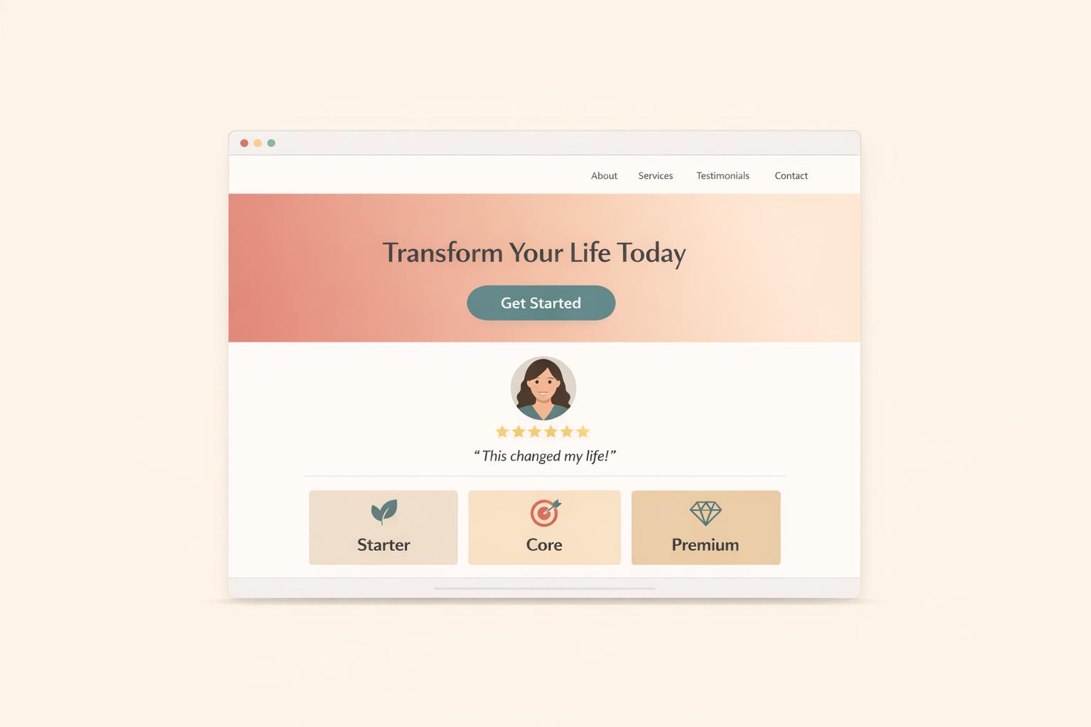
Your coaching website’s homepage is your first and most important chance to connect with potential clients. Within seconds, visitors decide whether to stay or leave. To make an impact, focus on these key elements:
- Clear Hero Section: Use a headline that explains who you help and the results you deliver. Add a subheadline for context and a strong call-to-action (e.g., "Book Your Free Discovery Call").
- Value Proposition: Highlight why someone should choose you. Focus on outcomes clients can achieve, not just the services you offer.
- Trust Builders: Include testimonials, success stories, and badges from media features or certifications to establish credibility.
- About Section: Share your story and credentials with a personal touch. Use a professional photo that matches your coaching style.
- Service Overview: Present your services clearly with simple descriptions and, if needed, a pricing table to compare options.
- Simple Navigation: Keep your menu intuitive with 4–6 core links and a clear call-to-action button.
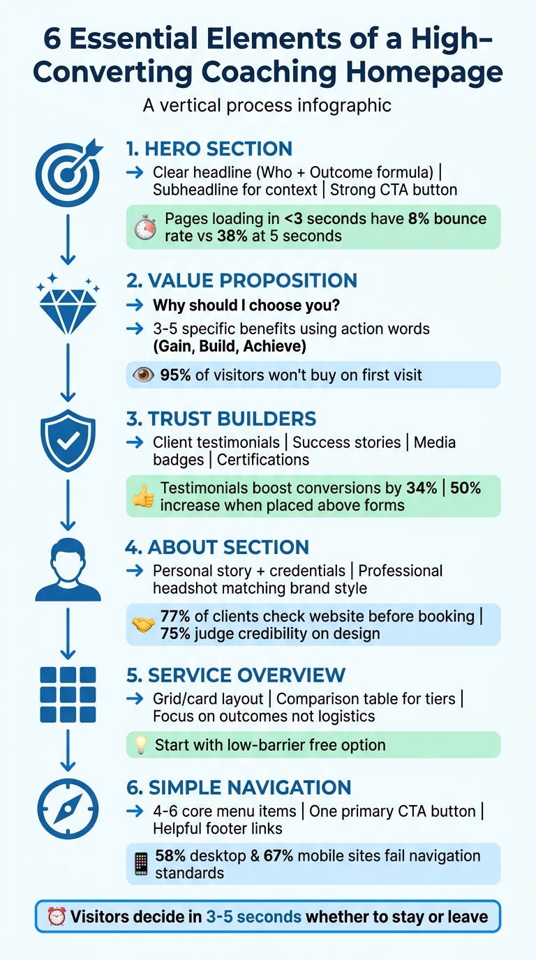
Essential Elements of a High-Converting Coaching Website Homepage
11 Coaching Website Examples That Actually Book Clients
sbb-itb-f7e72a6
Design Your Hero Section
Your hero section, the part of your homepage visible before scrolling, needs to answer one critical question right away: "Can you solve my problem?" This section acts as a decision-making shortcut for visitors. If it leaves them confused or unsure, they'll likely move on.
"Your homepage isn't an introduction. It's a decision shortcut. If buyers land on your site and feel confused, they won't keep reading, they'll move on." - Megan Desjarlais, Founder, Purpose & Pixel [7]
A high-performing hero section combines three key elements: a clear headline that explains who you help and the transformation you offer, a subheadline that provides context or details on how you achieve results, and a compelling call-to-action (CTA) that directs visitors on what to do next. Together, these components create clarity and momentum. Without them, visitors leave. For instance, pages that load in under three seconds have bounce rates as low as 8%, but this increases to 24% at four seconds and 38% at five seconds [5].
This design approach not only grabs attention but also reinforces your credibility as a coach. Let's explore how to craft each element effectively.
Write a Clear Headline
Your headline needs to pass the five-second test. Use the "Who + Outcome" formula to clearly define the audience you serve and the transformation they can expect.
For example, instead of a vague line like "I help people thrive", try something more specific: "Helping ambitious women reconnect with their confidence, set powerful goals, and build lives they love" [2]. This works because it identifies the audience (ambitious women) and their desired outcome (confidence, goals, fulfilling lives). Another example: "I design strategic Squarespace websites for established women service providers and creative professionals, so your online presence finally has the authority to attract the premium clients your expertise deserves" [7].
Avoid lengthy backstories, unclear language, or generic statements that fail to explain how you help [7]. A headline's purpose isn't to tell your life story - it's to establish an immediate connection between the visitor's problem and your solution.
"Personal brand pages fail when they try to tell the founder's entire story. Nobody arrives wanting a biography. They arrive with a problem. The page's job is to make the connection between their problem and this person's ability to solve it, as quickly and clearly as possible." - Waseem Bashir, CEO, Apexure [6]
Design plays a role too. Use bold, confident fonts to convey authority before visitors even read the words [6]. Ensure your headline is tagged as H1 for SEO and accessibility purposes.
Once your headline sets the stage, your subheadline should add depth and context.
Add a Subheadline for Context
The subheadline supports your headline by explaining the "how" behind your promise. It adds emotional or practical details about your approach without overwhelming the reader. Think of it as the supporting element that strengthens your main message.
For instance, a subheadline could describe your methods: "With proven strategies, accountability, and support, you can unlock your full potential." Or it could clarify who you serve: "Designed for executives who want to lead with confidence while maintaining work-life balance."
Keep it short and to the point. The subheadline should feel like a natural extension of your headline, answering questions like: What makes your approach different? What methods do you use? What can clients expect from working with you?
A great example comes from Apexure's review of the Jeremiah O'Brian coaching homepage, which scored 8/10 for messaging, with a ConvertScore™ of 76/100 [6]. The homepage excelled because the headline and subheadline worked together seamlessly, each serving a distinct purpose.
After establishing clarity with your text, guide visitors to take action with a strong call-to-action.
Include a Strong Call-to-Action
Your call-to-action (CTA) is what turns interest into action. Once visitors read your headline and subheadline, they need clear instructions on what to do next. A well-crafted CTA makes that step effortless.
Use specific, action-oriented language. Instead of vague phrases like "Learn More" or "Get Started", opt for something direct: "Book Your Free Discovery Call" or "Start Your Transformation Today." These CTAs clearly communicate what visitors can expect when they click.
Stick to one primary CTA. Research shows that offering multiple competing CTAs can reduce conversion rates by up to 266% [4]. If you need a secondary option, like "Download Free Guide", make it visually less prominent so it doesn't distract from your main action.
Design your CTA for visibility. Use contrasting colors to make the button stand out, and ensure it's large enough for easy tapping on mobile - especially since over 66% of internet traffic comes from mobile devices [1]. Place the button strategically, right after your headline and subheadline, to create a natural flow.
The visual hierarchy matters: visitors should first notice your headline, then your subheadline, and finally your CTA button. This progression takes them from recognizing their problem to seeing the solution and taking action. Also, keep your hero section media optimized - every additional 100 KB in media weight can increase bounce rates by 1.8% [5].
Show Your Value Proposition
Your value proposition needs to answer one crucial question right away: "Why should I choose you?" Visitors should grasp this within seconds - before they decide to stay or move on [3]. This isn't about showcasing your credentials or explaining your process. It's about showing how you can turn your clients' challenges into success stories.
Focus on results, not the nitty-gritty. For instance, instead of saying "12 one-hour sessions", highlight what those sessions deliver, like: "You'll leave with a proven 5-step sales process" [3]. Think about how Uber simplifies its pitch: "one tap, cashless, simple", instead of overwhelming users with service details [10]. Dan Shewan from WordStream puts it perfectly:
"A value proposition tells prospects why they should do business with you rather than your competitors, and makes the benefits of your products or services crystal clear from the outset." [10]
Make sure your value proposition answers three key questions: Who do you help? What do you help them achieve? And how do you do it? Structure this section with a bold headline, a subheadline for added context, and a concise list of 3–5 benefits [9]. This way, visitors can quickly understand your offer without feeling overloaded. Afterward, dive into the specific benefits your clients can expect.
List Your Key Benefits
When listing benefits, focus on 3–5 specific outcomes clients will gain. Keep it concise to maintain clarity [2]. Use action-oriented language like "Gain", "Build", "Achieve", or "Shorten" to make the results feel immediate and tangible [10]. For example, instead of vague promises, aim for concrete results like:
- "Gain Clarity on Your Goals"
- "Build Confidence in Your Leadership"
- "Achieve Sustainable Growth"
Frame each benefit in terms of how it impacts the client's life or business. For instance, instead of saying "A/B testing", you could say "Testing without tech headaches" [10].
If possible, develop a branded methodology to make your approach memorable, such as "The Radical Results Method" [3]. Coach Jen Carrington does this effectively by describing her expertise as "supporting online business owners to build and run simple, spacious, and thriving businesses" [8]. She’s not just listing services - she’s painting a picture of the transformation clients can expect.
Position your benefit list prominently on your homepage, ideally under the hero section. Use visual hierarchy to make these benefits stand out, as visitors typically focus on the top of the page [11]. Keep in mind that roughly 95% of website visitors won’t be ready to buy on their first visit [3]. Your benefits should build trust and encourage them to return.
Use Visuals to Support Your Message
Visuals can be a powerful way to reinforce your benefits and communicate your value quickly [7]. The right images, icons, or videos can create an emotional connection, bridging the gap between your website’s design and your expertise. Match your visuals to your brand’s style - use vibrant, energetic imagery for business coaching or calm, soothing visuals for wellness coaching [3]. Stick to a consistent color scheme to strengthen your brand identity.
Icons are another great tool for making your page easy to scan. Pair each benefit with a relevant icon to add visual interest and make your message clearer [9]. For example, a compass icon might represent "Gain Clarity", while a growth chart could symbolize "Achieve Sustainable Growth."
Consider adding videos or step-by-step images to help visitors visualize what working with you looks like [9]. A short, 30-second video of you speaking directly to the camera can make your brand feel more personal and trustworthy. Since over 66% of internet traffic comes from mobile devices [1], ensure all visuals are mobile-friendly and don’t slow down your site.
High-quality visuals aren’t just for show - they signal professionalism. Invest in professional photography or branded graphics that align with your messaging. When your visuals reflect the premium nature of your services, visitors will immediately associate your brand with higher value and credibility [7].
Build Trust with Testimonials and Social Proof
After highlighting the value of your coaching, it's time to let your clients' voices do the talking.
When your coaching claims to deliver transformation, testimonials and social proof make those claims feel real and credible [12]. Think of social proof as your "trust currency" - a must-have when you're asking clients to invest thousands of dollars in premium coaching services [3]. As web designer Kenn Schroder puts it:
"If I could ONLY POST ONE TYPE OF CONTENT on a coach's website, it would be testimonials - or success stories." [12]
Testimonials and third-party validation not only establish your authority but also make your business feel solid and trustworthy. For someone encountering your brand for the first time, seeing that you've been featured in respected publications or helped others achieve real results can erase doubts [13]. In fact, strategically placed testimonials can boost website conversions by 34%, and placing one just above a lead form can increase submissions by 50% [14][15]. These testimonials aren't just feel-good extras - they're powerful tools that address the uncertainty of potential clients by proving your track record [3].
Here's how to select and present testimonials for maximum impact.
Choose Client Testimonials That Work
The most effective testimonials focus on specific, measurable results rather than vague compliments. Instead of "Sarah was great to work with", look for testimonials that follow the Before-During-After Framework: what the client struggled with initially, what they experienced during coaching, and the tangible results they achieved [12]. For example, phrases like "tripled revenue", "gained clarity on my five-year plan", or "boosted productivity by 40% in three months" resonate far more than generic praise [3][2].
When gathering testimonials, opt for live conversations instead of email requests. Speaking directly with clients allows you to uncover richer details and emotional insights, which make testimonials more compelling [12]. Ask them to share their challenges before working with you, the process they went through, and the specific outcomes they’ve achieved. These stories can be repurposed across your marketing - on your homepage, during discovery calls, or even on your LinkedIn profile [12].
Format Testimonials for Maximum Impact
Real photos and names build trust far more effectively than anonymous initials or stock images [14]. Include full names, job titles, and professional photos alongside key metrics (e.g., "3X'd revenue") to enhance credibility. For instance, "Sarah Johnson, Founder of Acme Inc." carries much more weight than a vague "Sarah" [14][15]. If privacy is a concern, use their first name and last initial along with their role or industry.
Position testimonials thoughtfully - place them near high-intent areas like pricing sections, just above signup forms, or within 200 pixels of your main call-to-action [15][14]. Testimonials placed strategically near CTAs can boost conversions by up to 24% [15].
Video testimonials are even more impactful, converting 80% better than text-based ones. A short, 30-second clip of a client speaking directly to the camera can work wonders - just ensure it's mobile-friendly [14]. If you use a testimonial slider, avoid auto-play or set a slower interval (15–20 seconds). Always include manual navigation options, as auto-rotating carousels often frustrate users by moving too quickly [14][15].
Add Badges and Awards
Beyond testimonials, third-party validations like media features or certifications can further solidify your credibility.
Create a "Brag Bar" - a row of logos from media outlets, podcasts, or certification bodies you’ve been associated with [13]. If you've been featured in outlets like The New York Times or earned industry-recognized certifications, showcase those logos prominently. Marketing expert Elise Dopson explains:
"Social proof from well-known publications signals trust and authority. For new visitors, this third-party validation can go a long way in making your company feel established and reputable." [13]
For coaches, credentials like professional certifications, degrees, or industry awards confirm your expertise and methods [16][3]. Display badges from review sites or industry recognitions to provide unbiased proof of your service quality [17]. Highlight "authority numbers" as well - like total clients coached, years in business, or even content reach (e.g., "500+ clients coached" or "Featured in 12 publications") [3][17].
Position these trust-building elements above the fold or near your primary call-to-action to reassure visitors at critical decision points [15][14]. Use contrasting designs to make them stand out without distracting from your main message [14][17]. Combining a standout testimonial, recognizable logos, and a star-rating summary creates a "trust stack" that amplifies your credibility and nudges visitors from interest to action [15].
Introduce Yourself
Once you’ve established trust, it’s time to connect on a more personal level. Did you know that over 77% of coaching clients check a coach's website before booking a session? And, here’s the kicker: 75% of their credibility judgment is based on how the site looks and feels [18][19]. That means your "About You" section isn’t just a formality - it’s the bridge between showcasing your expertise and proving you’re someone they can trust. Let’s explore how your personal story, professional image, and credentials can make that connection even stronger.
Write a Short Bio
Skip the boring, resume-style bio. Instead, share your journey and the “why” behind your work as a coach. A great example? Preston Smiles uses his personal story of overcoming struggles to connect with his audience on a deeper level. That kind of vulnerability builds trust in a way a list of achievements never could [3]. Similarly, Craig White uses first-person language to speak directly to his audience’s frustrations. Phrases like, “I know what it’s like to feel stuck,” make visitors feel seen and understood [19].
The secret? Balance expertise with approachability. Start with a warm, inviting tone, then naturally weave in your qualifications. Your story doesn’t just set you apart - it’s the final step in building trust with potential clients. Speak directly to their fears and aspirations rather than focusing solely on your accolades.
Add a Professional Headshot
Your headshot isn’t just a photo - it’s a visual representation of your brand. It should reflect the energy and vibe of your coaching style. For instance:
- Dynamic and polished photos work well for business coaches.
- Calm and authentic imagery suits wellness coaches [3].
Take Marie Forleo, for example. Her vibrant, energetic photos communicate creativity and approachability. On the other hand, Gabby Bernstein’s soft, neutral-toned images create an instant sense of calm and spiritual connection. Mel Robbins? Her no-nonsense, relatable photos align perfectly with her brand, appealing to clients who are tackling challenges like anxiety or procrastination [3].
"Your photos should match your brand. Are you a high-energy business coach? Your photos should be dynamic and professional. Are you a wellness and mindfulness coach? Your photos should feel calm and authentic." - Itamar Haim, Web Creation Expert [3]
Invest in professional photography that aligns with the transformation you promise your clients. A polished, authentic image builds credibility and closes the gap between your expertise and how your website represents you [7].
Share Your Credentials and Story
Once you’ve shown your expertise through testimonials and results, your personal story ties everything together. Start by sharing your journey, then reinforce it with your credentials. For example, Roberto Mandje highlights his career as an Olympic runner and his achievement of completing 7 marathons in 7 days. This not only establishes his credibility but also attracts high-performance clients like Casey Neistat, whom he coached to a sub-3-hour marathon [8]. Similarly, Carrie from Coaching by Carrie uses her Juilliard education and opera background to position herself as the go-to coach for vocalists and actors [8].
If you’ve developed a unique framework or system, like Mel Robbins’ "5 Second Rule", make sure to highlight it. This helps make your coaching process feel tangible and sets you apart from others [3]. Use storytelling to present your credentials in a way that resonates with your audience’s goals and dreams.
"Your story is your superpower. Sharing your struggles (and how you overcame them) is the fastest way to build a deep, human connection with your audience." - Itamar Haim, Web Creation Expert [3]
Present Your Services Clearly
After showcasing your value proposition and building trust, it's time to guide potential clients through your services. As Itamar Haim aptly says:
"A confused mind always says no. If your visitors cannot find what they are looking for, they will leave." [3]
Make your services easy to understand. Provide a straightforward overview that outlines what you offer and how clients can engage with you. Since many visitors may not be ready to commit immediately [3], ensure they can grasp their options at a glance and revisit when they’re ready. Focus on the results clients can expect rather than the logistics - so instead of saying "12 one-hour sessions", emphasize outcomes like "a proven 5-step sales process" [3].
Use a Grid or Card Layout
A grid or card layout works wonders for presenting your services. It allows visitors to quickly scan through options without feeling overwhelmed. Think of it as a menu that guides them to more detailed information. Keep each card simple - use icons and short descriptions (under 40 words) to summarize offerings like 1:1 coaching, group programs, or workshops [20]. Each card should link to a dedicated detail page and stack neatly on mobile devices [20].
Compare Service Tiers
Once your services are visually listed, help clients differentiate between options by using clear service tiers. A comparison table works well for this. For instance, in January 2026, coach Leah Pearlman used a transparent pricing table on her Webflow-based landing page. Her table featured three tiers: a Free Consultation (45 minutes, $0), Individual Sessions (90 minutes, $450), and a Pack of 4 Sessions ($1,600). This approach earned a ConvertScore of 75/100 by offering a free session as a low-risk entry point, making it easier for visitors to choose without needing to reach out for basic details [20].
Start with an accessible, low-barrier option and clearly highlight any discounts for bundles. To further justify the investment, place a testimonial near your pricing table. As Waseem Bashir points out:
"The testimonial that compares coaching to therapy is doing price-justification work... it reframes the price from 'expensive coaching' to 'efficient therapy alternative.'" [20]
Here’s a simple example of a pricing table format:
| Service Tier | Features | Price |
|---|---|---|
| Free Consultation | 45-minute introductory session | $0 |
| Individual Session | 90-minute deep dive coaching | $450 |
| 4-Session Pack | 4 x 90-minute sessions (Save $200) | $1,600 |
Each tier should have a clear call-to-action button, like "Book a Call" [2][7].
Simplify Navigation and User Experience
Your homepage might have stunning visuals and engaging copy, but if visitors can’t easily find what they’re looking for, they’ll leave. Navigation plays a crucial role in shaping the user experience. As Suzanne Scacca, a web design expert at Progress, puts it:
"Website navigation is a vital part of the user experience. It's also an important tool that allows brands to guide visitors throughout that experience instead of leaving them to their own devices." [22]
The numbers don’t lie: 58% of desktop sites and 67% of mobile sites fail to deliver even a "decent" navigation experience [21]. To avoid falling into that category, ensure your homepage navigation is simple, intuitive, and designed with your audience in mind.
Once you’ve established trust and communicated your value proposition, the next priority is to optimize navigation. A well-organized site helps visitors move effortlessly through your content and take the actions you want.
Keep the Top Menu Simple
Your main navigation should focus on 4–6 core items - such as Home, About, Services, and Contact. Overloading your menu with too many options can confuse visitors and lower the chances they’ll take the next step [23]. Stick to familiar, clear labels like "Services" instead of vague or overly creative names like "My Magic" or "Work With Me." Visitors typically decide within 3 seconds if they’re in the right place [3], so clarity is key.
Add a single, high-priority call-to-action button - like "Book a Call" - in your header to direct users toward your primary goal. Also, ensure your logo in the top-left corner links back to the homepage. This is a standard expectation and helps users reset their navigation easily [11].
Add Helpful Footer Links
While the top menu focuses on primary actions, the footer serves as a catch-all for secondary information. This is the perfect spot for links like your privacy policy [25], terms of service, social media profiles, and a newsletter signup form. As Ana Lea Amelio from Ley Design Studio explains:
"You also have to include a privacy policy on your page in order to comply with various internet privacy laws." [25]
Including a newsletter signup in the footer is a smart way to engage visitors who’ve explored your homepage but aren’t ready to convert yet. This keeps your header uncluttered while still offering essential information and a clear path for users to follow.
Conclusion
Your homepage acts as your round-the-clock digital office, often determining whether visitors turn into clients or leave without engaging [3]. With just 3–5 seconds to make an impression, every detail counts - from a clear headline and compelling value proposition to well-placed calls-to-action and trust-building testimonials.
The coaching industry is expanding quickly, and a cookie-cutter website no longer makes the cut [3]. Your homepage needs to immediately convey who you help, what results they can expect, and how you deliver those results - all visible above the fold. Since about 95% of visitors aren’t ready to book on their first visit [3], adding lead magnets and email capture forms can help nurture those potential clients.
Start by evaluating your homepage using the key elements outlined in this guide. Does your hero section clearly highlight your unique value? Are your services framed as transformative outcomes rather than just a list of sessions? Is your navigation intuitive enough for visitors to find what they need effortlessly? Addressing these questions will help pinpoint areas for improvement. Website designer Bia Alvarez emphasizes:
"The biggest mistake I see coaches doing on their website is not making it clear to the website visitor: 1) Who they are, 2) What they offer, and 3) Who they help within 5 seconds of that person landing on their home page." [24]
If your current homepage falls short on clarity, consider tools like Brandbase to simplify the redesign process. With features such as custom landing pages, AI-driven lead qualification, and ongoing support, you can focus on coaching while your website works to attract and convert clients. Keep your messaging clear, build trust, and make the next step easy - whether you're starting from scratch or refining what you already have.
FAQs
What should I say in my homepage headline?
Your homepage headline needs to quickly and clearly convey who you help and what you do. Visitors should immediately understand if your site is relevant to them. To achieve this, focus on being specific and highlighting the core benefit you offer.
For instance, a headline like "Helping Busy Professionals Achieve Confidence" or "Transform Your Life with Expert Coaching" works because it’s direct, simple, and speaks to a clear audience. Aim for clarity over cleverness, and make sure the message resonates with your target audience.
Where should I place testimonials on my homepage?
Testimonials deserve a prominent spot on your homepage to quickly establish trust and credibility. Position them in highly visible areas, like near the top of the page or within key content sections. This way, visitors encounter them early in their browsing journey. As powerful social proof, testimonials can influence potential clients' decisions and help build trust right away.
How many menu links should my site have?
Keeping your menu simple can make a big difference for user experience and conversions. While there’s no magic number, most successful coaching websites stick to 3 to 5 menu links. These typically include key pages like Home, About, Services, Testimonials, and Contact. This straightforward setup keeps navigation easy, prevents visitors from feeling overwhelmed, and encourages them to take action.
Related Blog Posts

Blog title heading will go here
Blog title heading will go here